A Retro-Modern Brand Identity
The Challenge: Adult support groups often suffer from “clinical” branding that feels sterile or medical. Autism Talks, a peer-led group in Colorado Springs, needed an identity that felt like a community hangout, not a doctor’s appointment.
The Solution: I developed a “Neon Retro” visual language that balances high-energy nostalgia with accessible design. The palette combines electric lime and hot pink with a grounding dark teal to create high contrast without visual clutter. This “Zero Pressure” aesthetic signals to autistic adults that this is a safe, authentic space to unmask, share experiences, and find belonging.
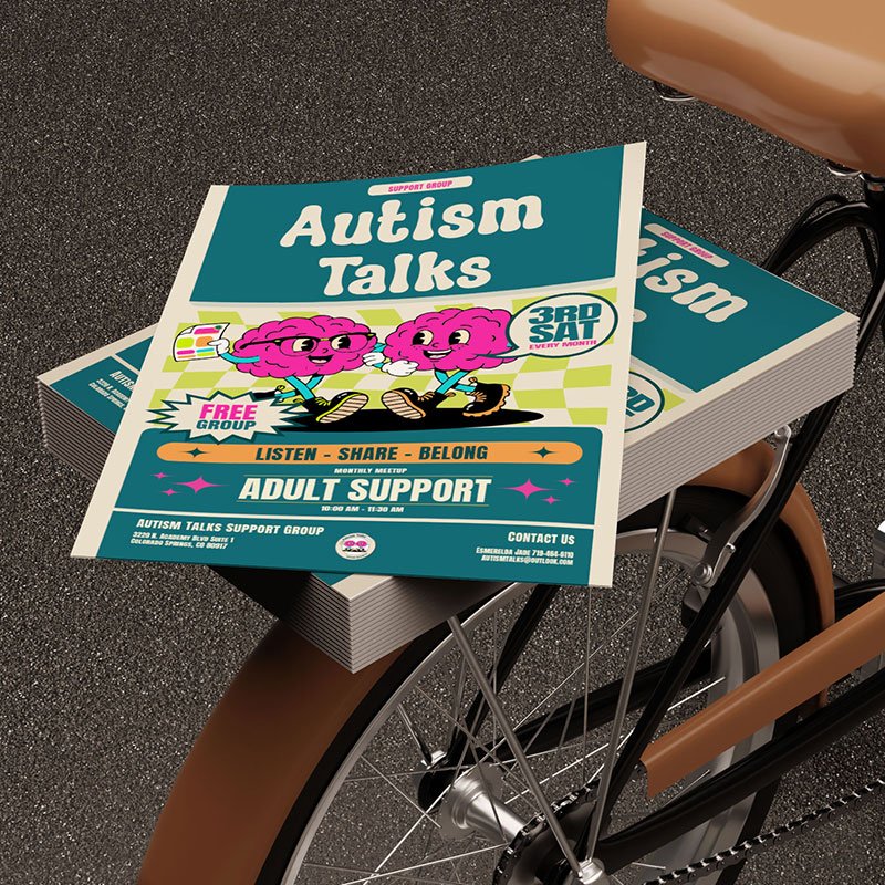
Flyer
Designed for high-visibility public spaces like colleges and libraries. The layout utilizes strict color-blocking and clear visual hierarchy to guide the eye, ensuring critical information. Like the “Free Group” badge and meeting times. They are instantly readable for neurodivergent viewer.
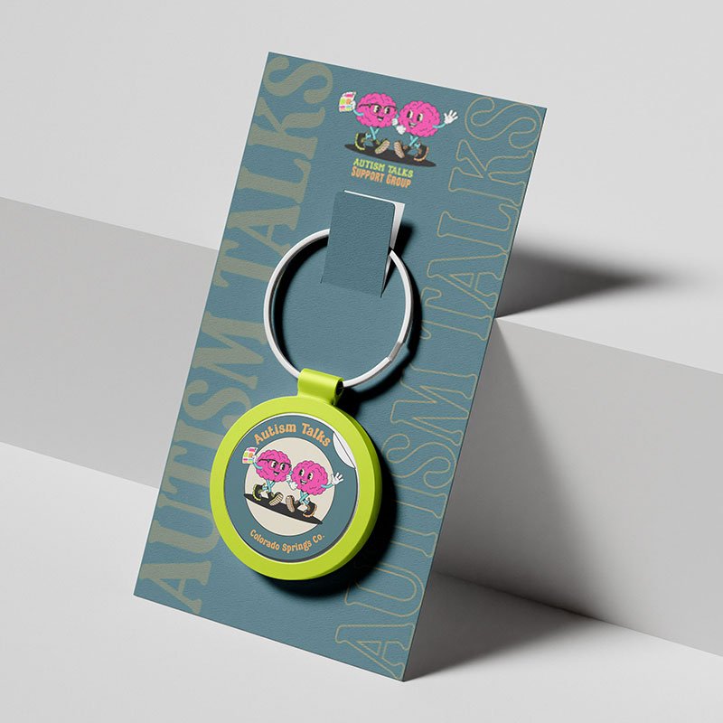
Key Chain
for everyday useThe circular logo was designed to function like a “club patch,” giving members a tangible sense of belonging. The simplified badge format ensures the brand remains distinct and recognizable even on small physical applications like enamel pins and key chains. Designed for everyday use.
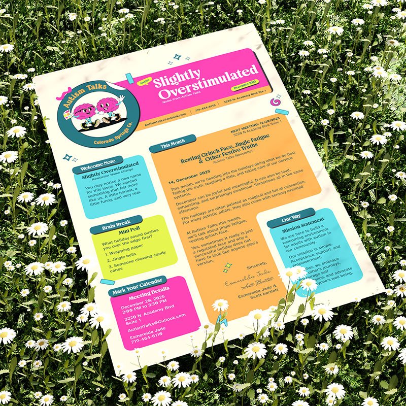
Newsletter
A communication tool that creates structure around emotional topics. This layout uses the brand’s “Structure Colors” (Teal/Orange) to organize logistics, while “Accent Colors” (Pink/Lime) highlight relatable humor and polls, making the monthly newsletter feel like a fun update rather than homework.
Copyright 2025, Esmerelda Jade Design CO. All Rights Reserved.